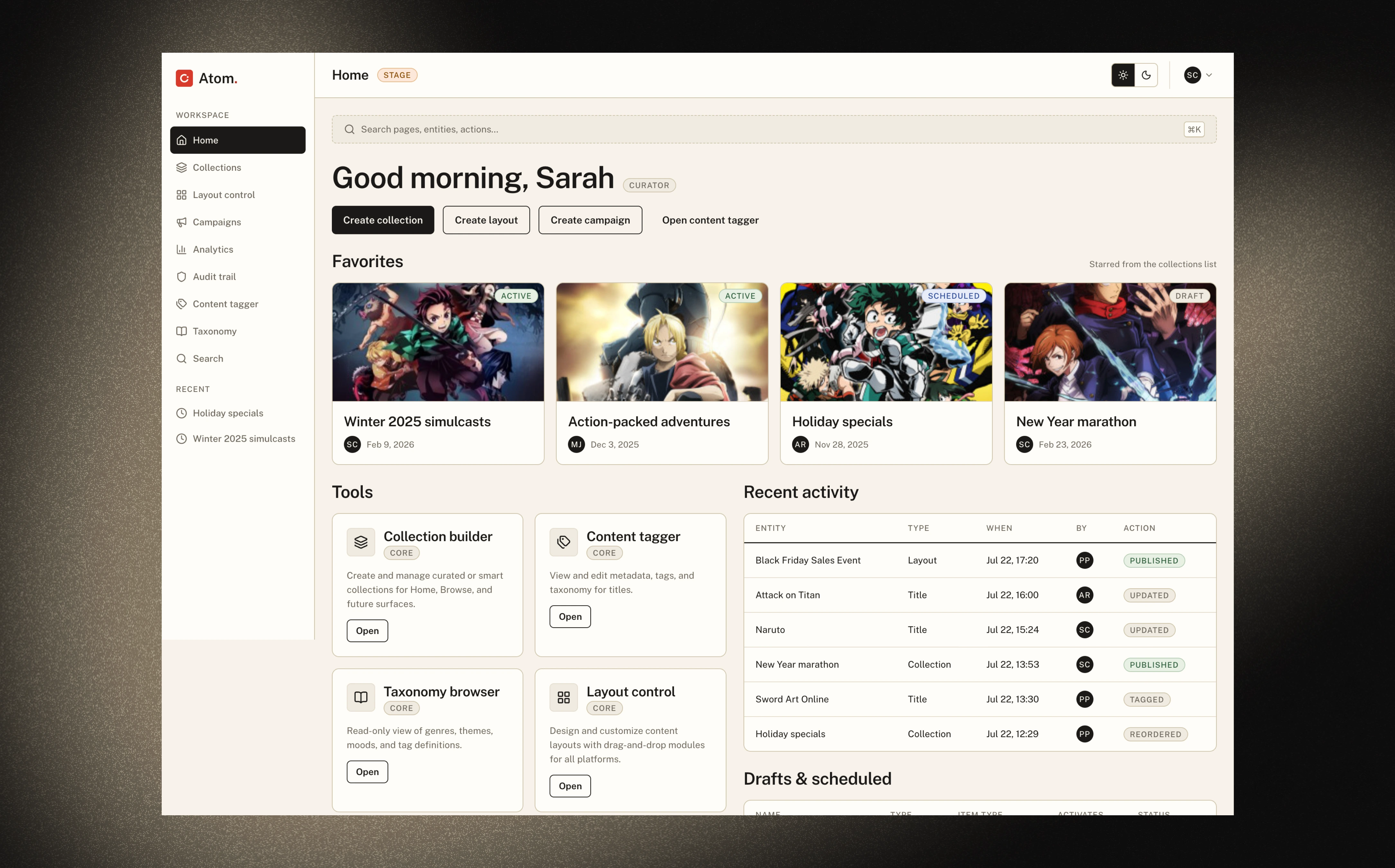
Crunchyroll's content team runs the home feed out of four separate tools. I built the one that replaces them: a working prototype you can click through, loaded with a real anime catalog, running on a design system that ships publicly alongside it.
Impact
- 4.2 hours saved per campaign launch, measured with three curators
- Four tools folded into one workspace
- The prototype became the engineering spec — developers built against it
- Stakeholders went from "why do we need this" to "when can we ship it" after one demo
The problem
Content editors build the home feeds that 200M+ users see when they open Crunchyroll. Every region gets its own: 67 regions, 10 languages, and a misconfigured feed goes live instantly to millions of people.
Building one took 60+ minutes across four systems — Foxhound for publishing, a campaign manager, a tagging tool, and spreadsheets for layout. Every launch meant switching tools, copy-pasting IDs, and hoping nothing broke in production.
None of that was the editors' doing. Four tools that don't know about each other will always cost you the time between them.
Why I built it instead of writing a spec
Months of Figma reviews had gone nowhere. Stakeholders could look at a mock and imagine a better version in their heads, so there was always another round of feedback.
So I built it. A prototype a curator could actually navigate forced the decisions a mock lets you defer.
Before building, I shadowed the curation team for a week. The thing that mattered most wasn't a workflow step — it was how much of the day went to switching between tools. The curation itself was a small fraction of the job.
Four rules shaped the build:
- One place for everything. All content in one store, every change recorded: who, when, what
- Complexity stays hidden until you need it. Rules, device previews, and bulk tools don't clutter the simple cases
- You always see what viewers will see. Live previews at desktop, tablet, mobile, and TV sizes
- Everything can be undone. Delete something and the toast offers it back
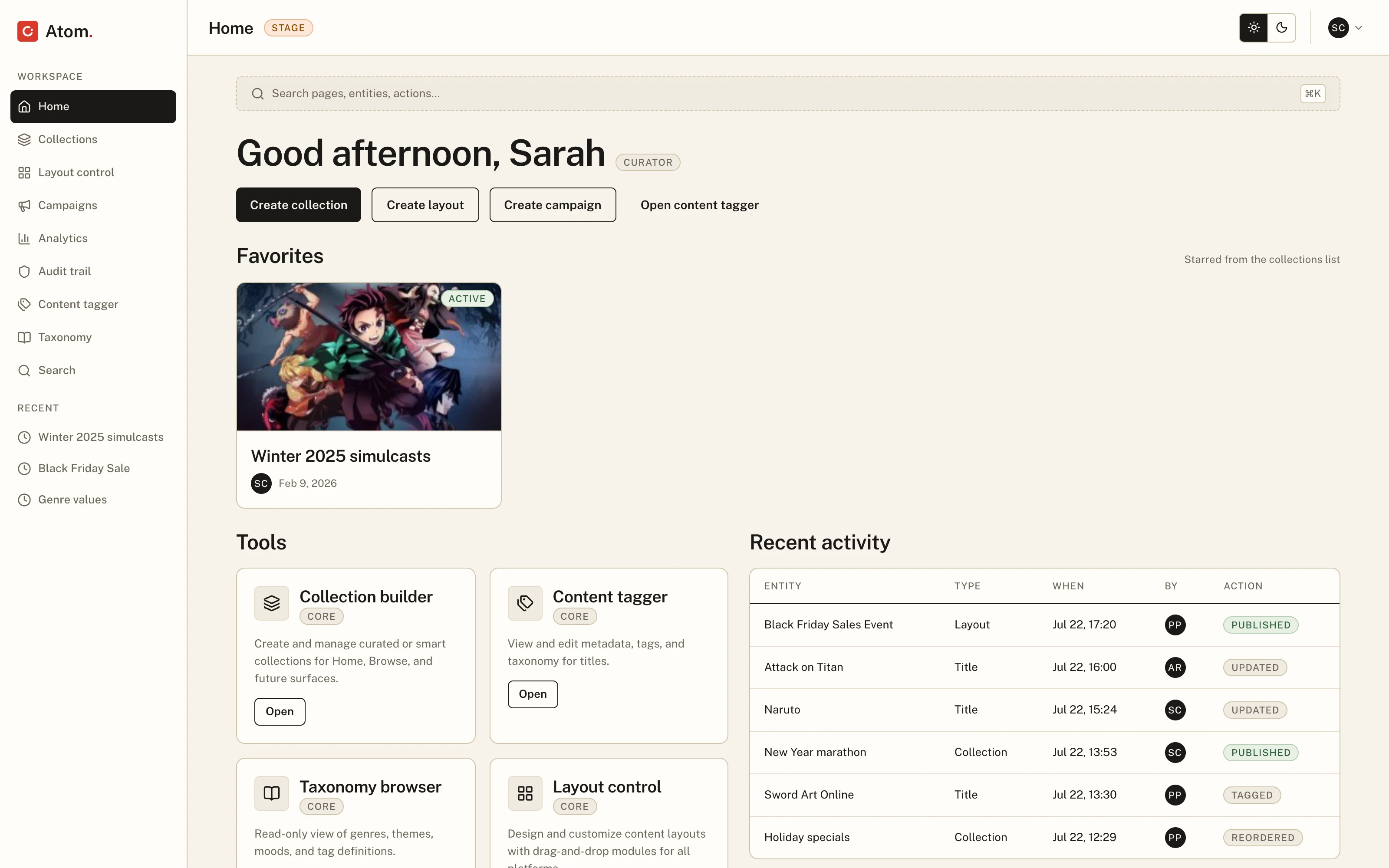
What it does
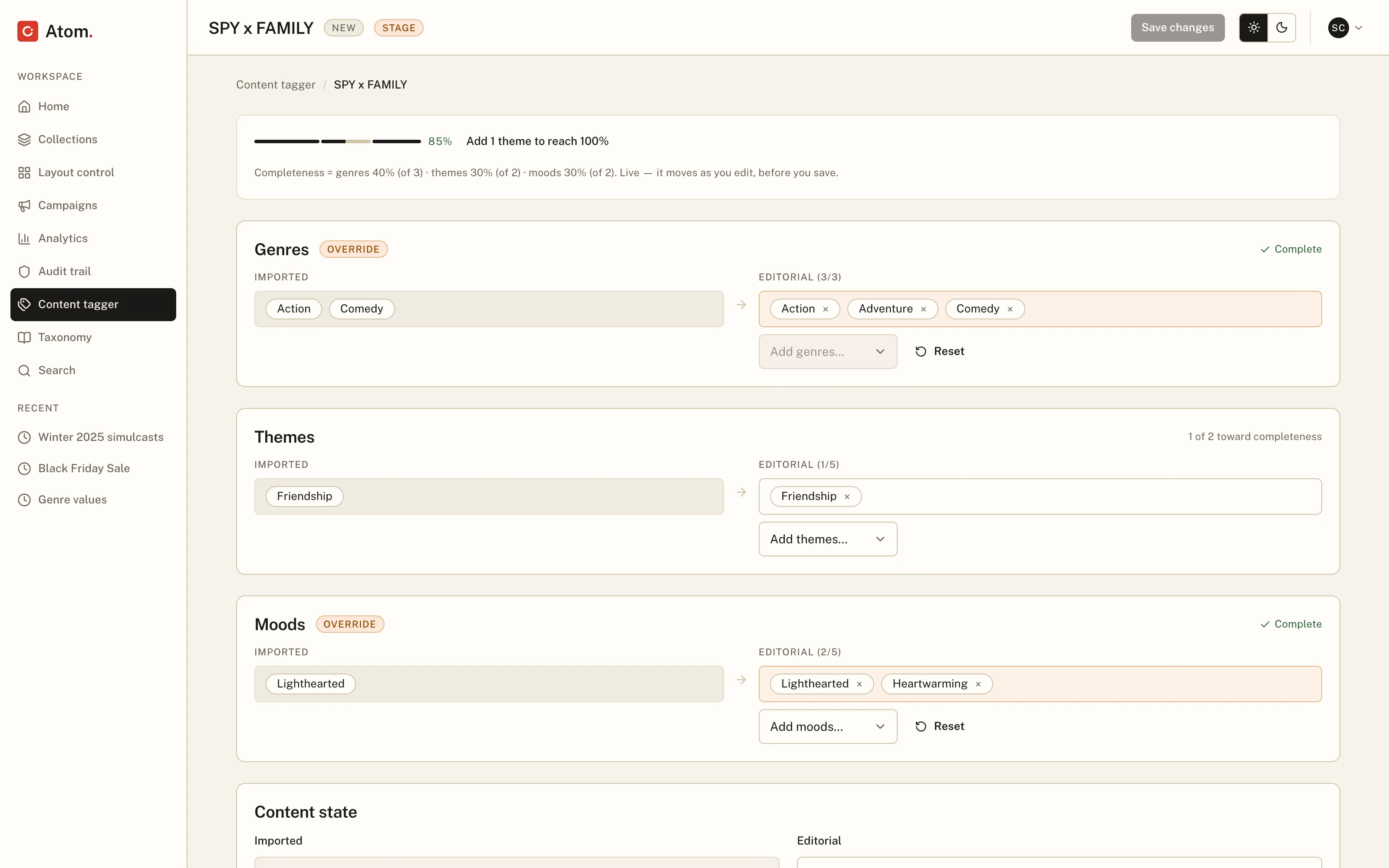
Tagging titles
Every show arrives with metadata from the catalog: genres, themes, moods. The tagger shows that imported data on the left, locked, and the team's own editable copy on the right. Edit a field and it gets an Override badge, so it's obvious the data no longer matches the feed. Nothing changes silently.
Instead of a vague completion percentage, the header tells you what to do next: "Add 1 theme to reach 100%."
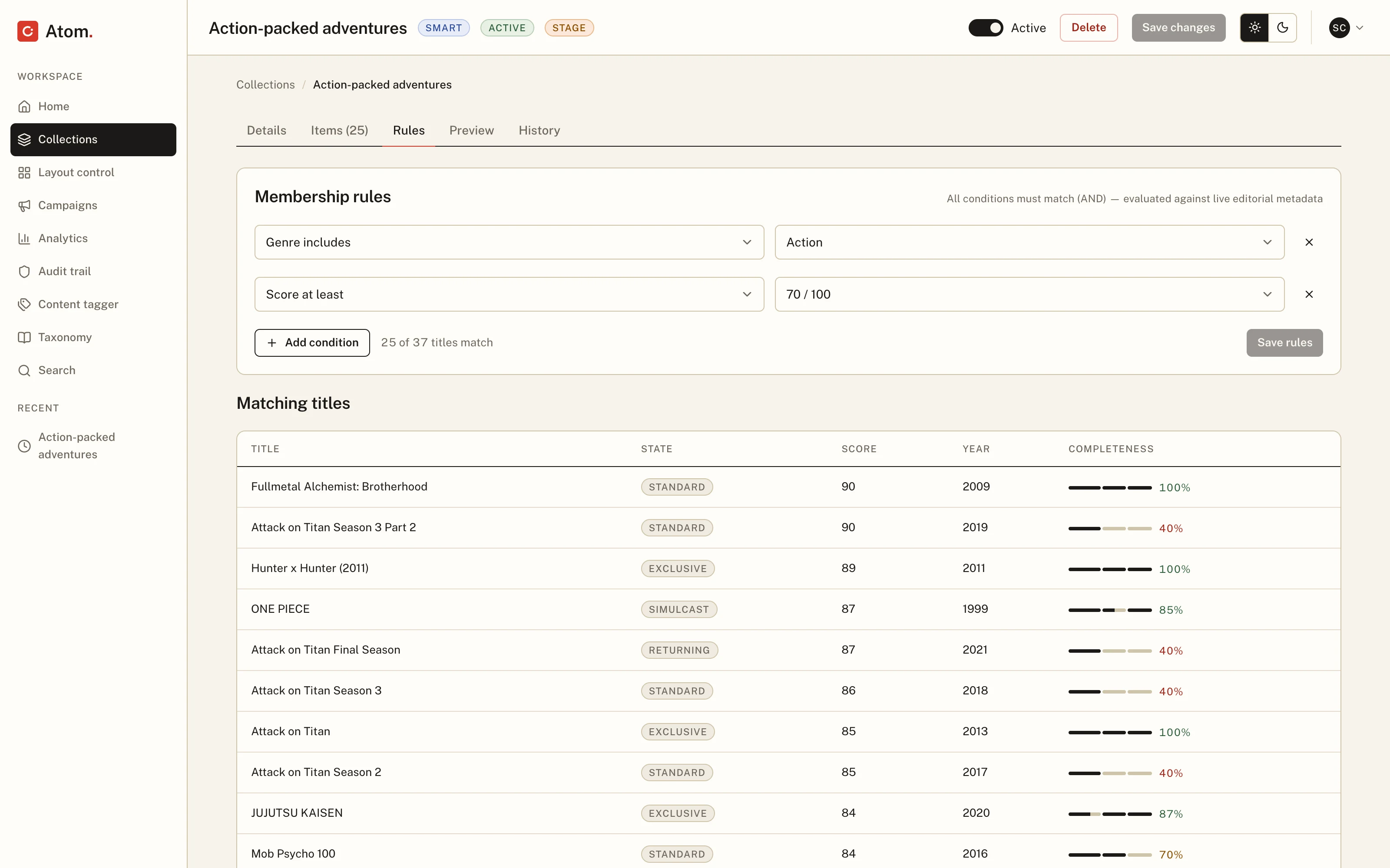
Collections that fill themselves
Collections can be hand-picked or run on rules — "genre includes Action," "score at least 70." As you type a rule, a counter updates live: 25 of 37 titles match. You see what a rule will do before you save it, and the collection stays current as tagging changes.
Fixing the catalog in bulk
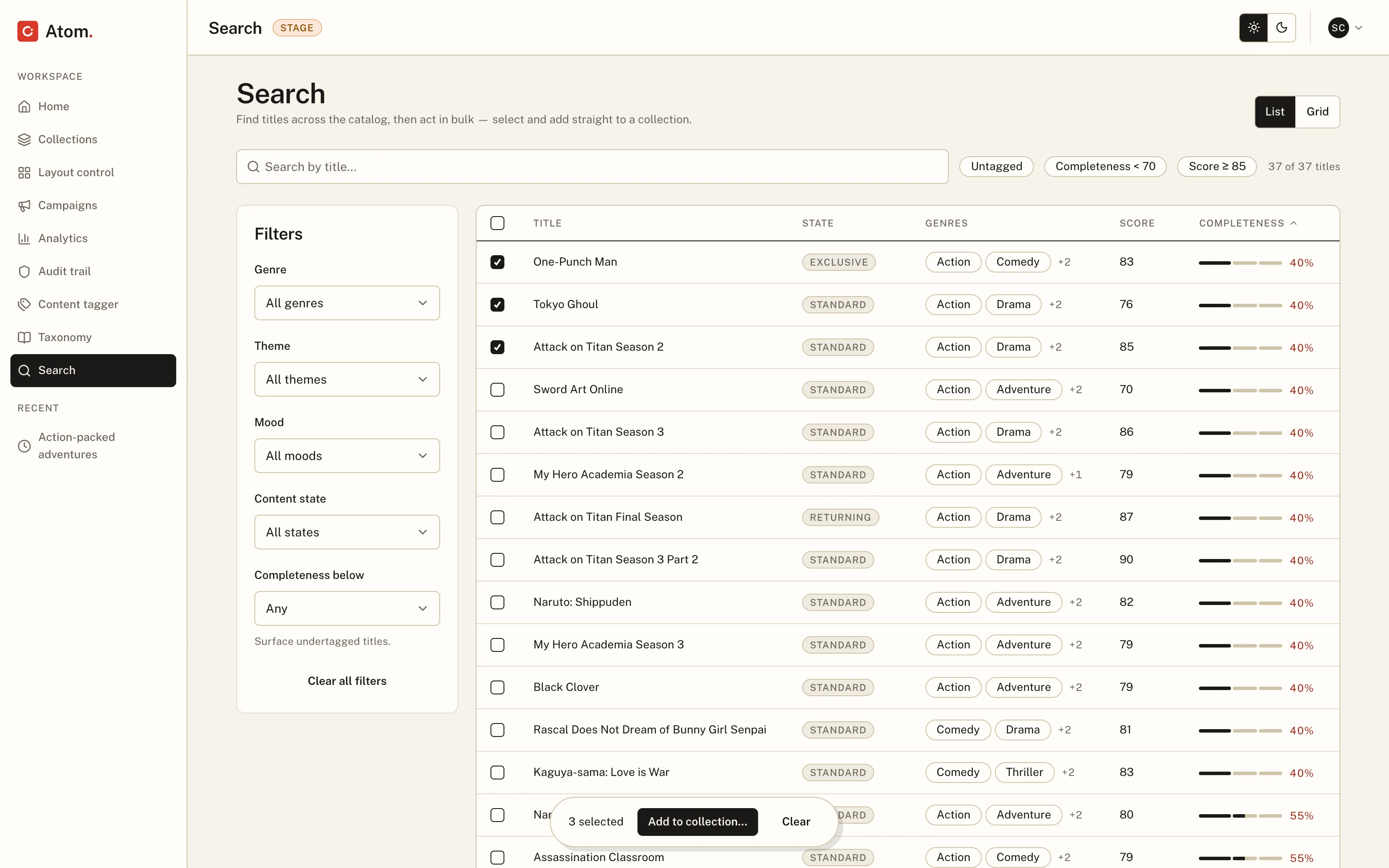
Search covers the whole catalog, with filters for what needs attention — untagged titles, mostly. Check a few boxes, add them all to a collection at once, undo if you picked wrong. Copy-pasting twenty IDs between tools is now three clicks.
Analytics without filing a ticket
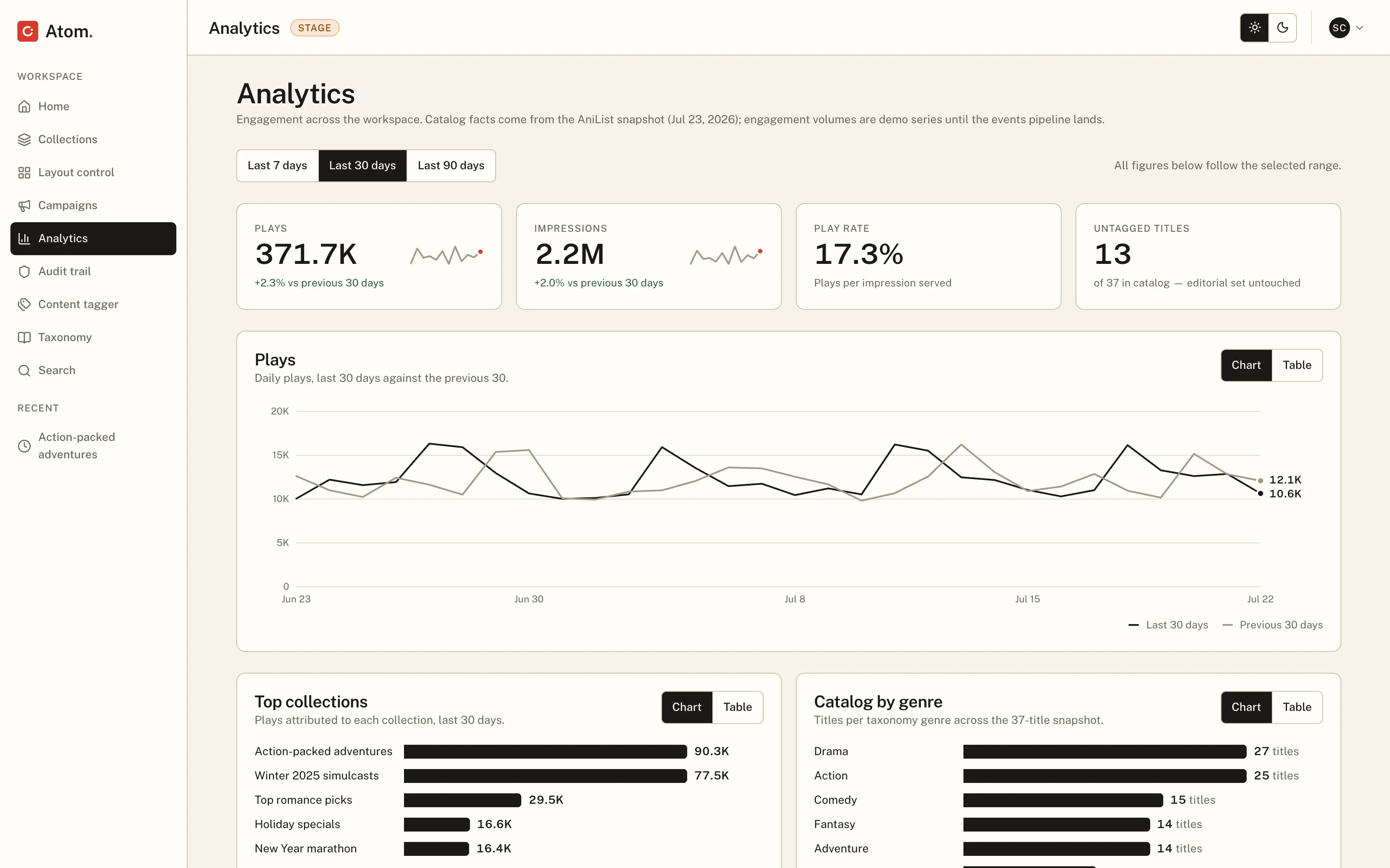
Performance data lives in the workspace, so editors don't have to ask another team what's working. The charts are deliberately plain: one dark line for now, one light line for the period before. Anything more complicated becomes a table, and every chart has a table view one click away.
The design system
The app is built on a design system I call Print Desk. The look comes from print: warm paper backgrounds, dark ink text, one red accent used the way a stamp is used. One typeface. Shadows are hard-edged, like paper resting on paper, instead of the usual soft blur.
Everything comes from one list
Every color, size, and font setting in the app comes from a single list of design tokens — an open standard format, so other tools can read it. Components can never use a raw hex value.
Every text-on-background combination in the product is contrast-checked automatically on every build, in both themes. If a change would make text hard to read, the build fails before anyone sees it.
Light and dark, both designed
Dark mode isn't the light theme inverted. It's a second reading of the same design: paper becomes ink, dark buttons become light ones, and status colors are rebalanced to stay readable. All of it happens through the token list, so no screen was patched by hand.
A style guide that renders itself
All 34 components have a page in the style guide: a live preview, the actual HTML and CSS pulled from the running app, and the docs. You can view any component at phone, tablet, and desktop widths, in either theme.
The documentation is written as structured data rather than freeform text, using an open spec called DSDS. The payoff is simple: the docs get validated like code, and the site renders them directly, so what you read is always what's true.
The Figma library is generated, not maintained
Design systems usually die in the gap between the design file and the code. Here there's no gap: the Figma library is generated from the same tokens the app uses. 102 variables, all 34 components, every color and size wired through. Switch a frame from light to dark in Figma and it re-renders correctly, shadows included. Every component links back to its docs and its source.
One repo holds the tokens, the code, and the docs. The style guide, the Figma library, and Storybook are all generated from it — nothing is copied by hand, so nothing can fall out of sync.
The honest caveat: this shape suits a small team shipping fast. At fifty-designer scale, where exploration happens in Figma all day, a Figma-first pipeline earns its keep. The architecture holds either way; what changes is which artifact you crown as the source.
Run like a product
The system is versioned, with a changelog and a contribution model that's itself validated by the same checks as the docs. Deprecations ship with migration paths. The health page counts its own tokens, docs, and tests from the repo on every build, so its numbers can't go stale.
What I'd do differently
Build the Figma library alongside the app from day one instead of at the end. Generating it from the tokens made it cheap to produce, but the final QA pass caught real bugs — a disabled checkbox whose checkmark was invisible in both themes — that would have surfaced weeks earlier with both sides growing together.
I'd also budget more time for state management. A workspace that remembers everything, with full history and undo, looks simple on screen and is anything but underneath.