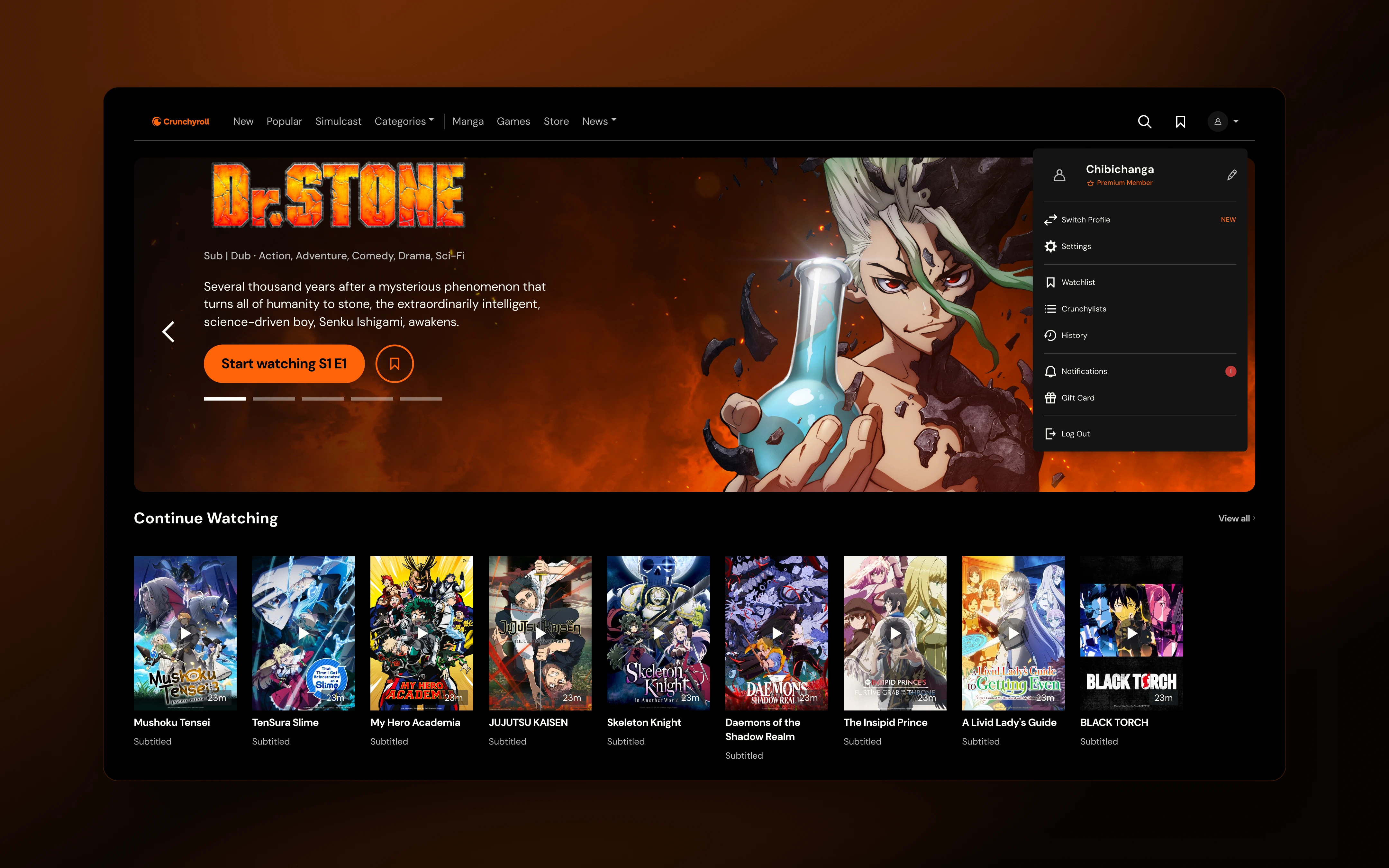
Crunchyroll's design org ran on 16 disconnected Figma libraries. I rebuilt them into one system that web, iOS, Android, and TV all share — and put it online, where every token and component is public.
Impact
- 95% designer adoption across 23 designers on 4 platforms
- 50% faster design-to-dev handoffs
- 67% faster component creation
- 40% faster dev implementation
- 5× lighter Figma file — from 40% of Figma's memory limit down to 8%
The problem
16 separate Figma libraries, one per platform, product area, and brand variant. No shared foundations. Design decisions lived in individual files with no connection to code.
The symptoms:
- The web library ate ~40% of Figma's 2GB memory limit
- A single Button had 96 variants
- 6 theme libraries needed manual syncing on every update
- Designers on different platforms were making the same decisions separately
- Handoff was slow, because the values in Figma didn't match the values in code
This wasn't a Figma problem. It was a systems problem.
The audit came first
I didn't start by redesigning components. I started by counting. The web file alone held about 395 component sets and 4,400 variants — and most of that volume wasn't design, it was duplication. Platform copies, breakpoint copies, and content baked in as variants.
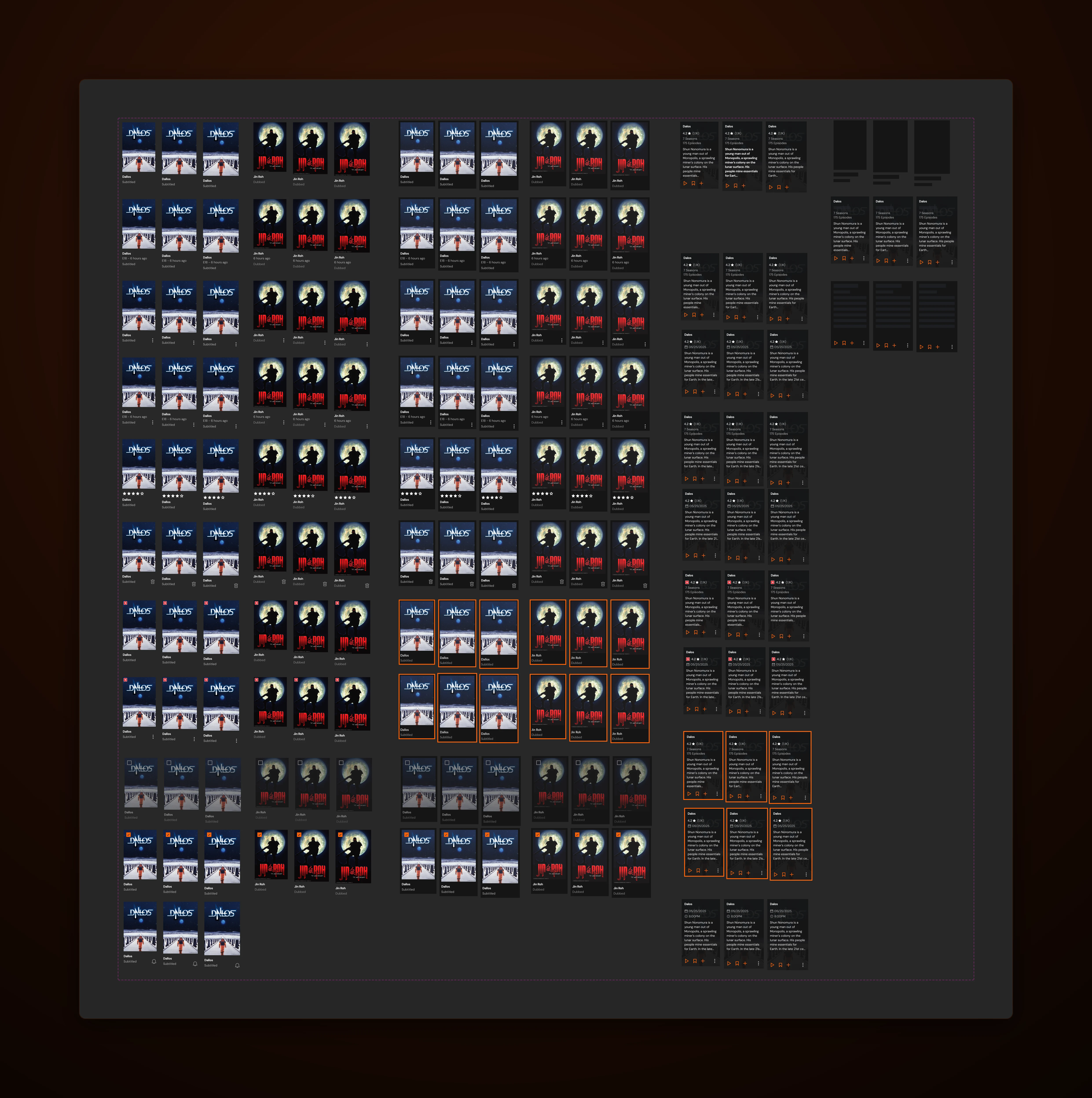
Every set got a verdict: keep, merge, or kill. Platform and breakpoint variants died everywhere, because responsive behavior belongs to code. Content types became data instead of variants. What survived was the actual system: about 50 components.
Tokens before components
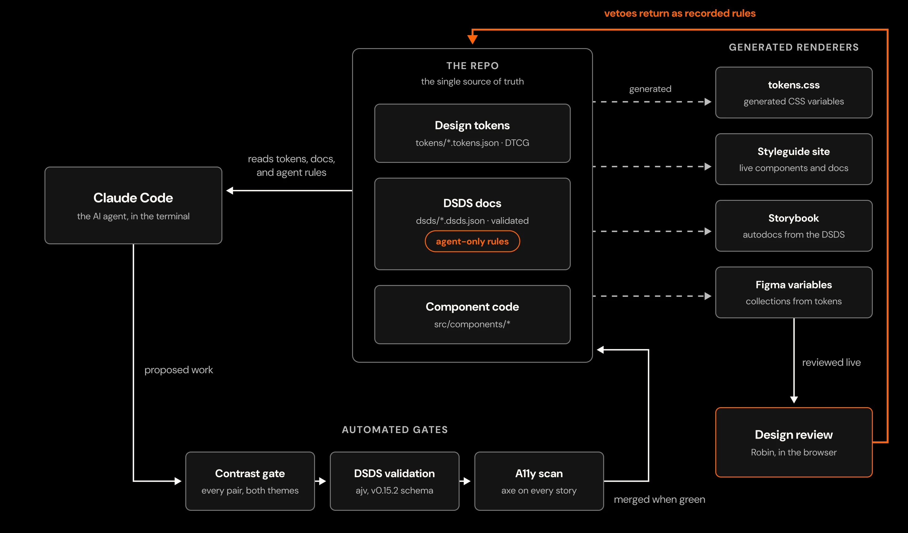
Every color, size, and type style lives in one set of token files. The CSS, the Figma variables, and the docs are all generated from them, so changing a value changes everything downstream at once.
The color system carries contracts. Every text-on-background pairing is contrast-checked on every build, in both themes. The audit found three real failures in the old system — disabled text sat at 1.7:1. The biggest ruling: brand orange is a fill, not a text color. It fails contrast on cream, which is why buttons carry dark text on orange. What used to be tribal knowledge is now enforced.
Typography went from 68 styles to 12. Desktop values are canonical and the step-down for smaller screens is code's job, so the scale never forks again.
Components, distilled
Button: 96 variants → 6. The 96 existed because every state, size, and style was a hand-maintained combination. The rebuilt Button is one size, six styles, six states, every paint wired to a token.
Cards: 1,021 variants → 39. The heaviest cut in the file. One thumbnail component owns every playback state — progress, watched, coming soon, unavailable, loading — and cards compose it instead of redrawing it.
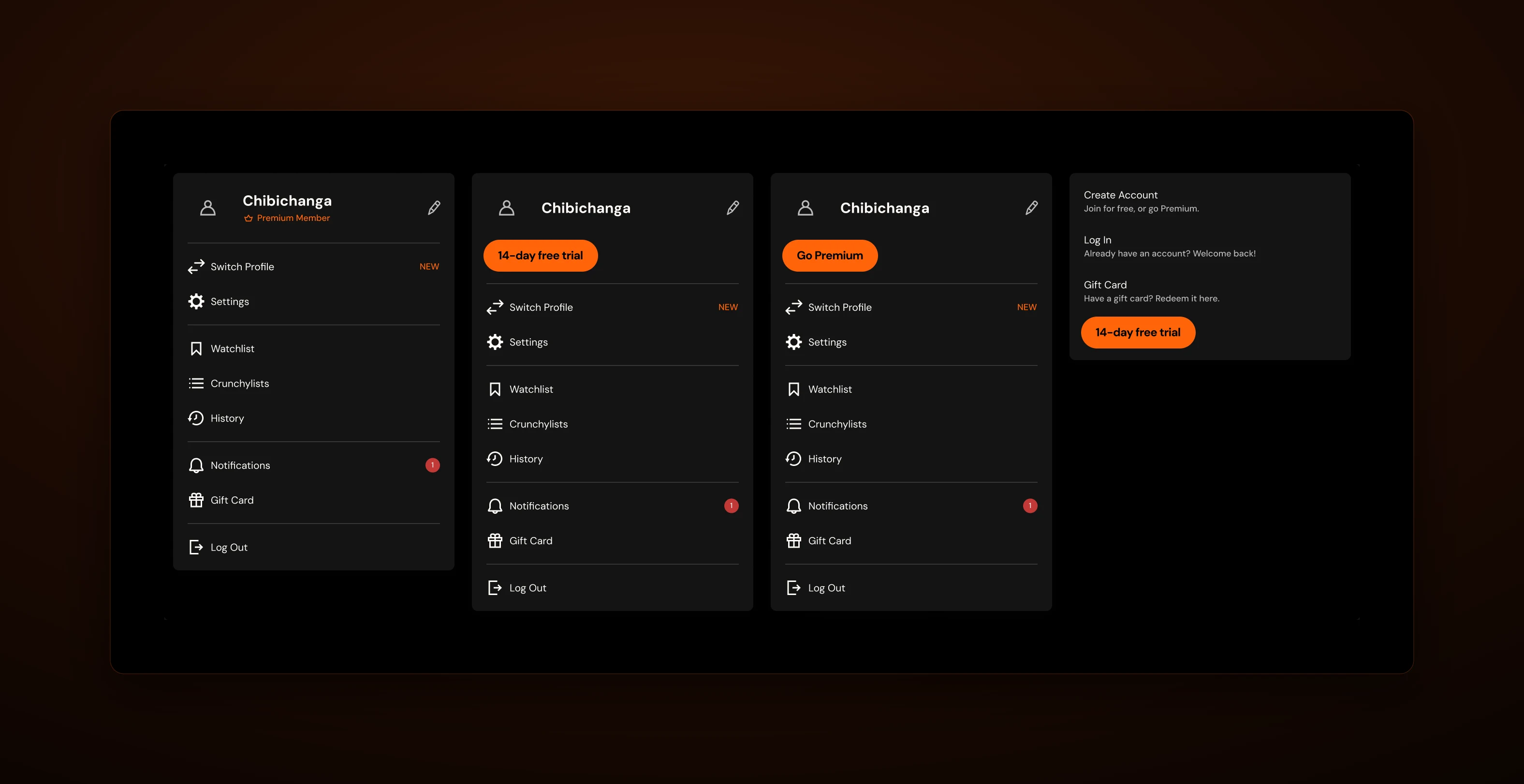
Navigation: one bar, six sessions. Premium members see no upsell. Free users get the crown chip. Logged out keeps the chip and a quiet account trigger, plus minimal and loading bars for auth flows and slow starts. Everything else in the bar is content, not a variant.
Menus are compositions, not snowflakes. The account menu that used to be a 50-variant matrix is now rows of one component with icon and chip slots — the same rows the player settings and the mega menu use.
Icons: the real ones. The library uses actual Crunchyroll glyphs, extracted one-to-one from the original icon sheet, with one 24px master per icon. Every glyph takes the text color around it, so state colors come free.
The system documents itself
The whole system ships as a public site built from its own tokens and components. Every component has a page: a live preview you can flip between themes and view at phone, tablet, and desktop widths, the HTML and CSS pulled straight from the running code, and links to the docs, the Figma masters, and the source. Nothing is pasted in, so nothing drifts.
The written docs are structured data rather than freeform text, following an open spec called DSDS. Every component records when to use it, when to reach for something else, its anatomy, its states, and the reason behind each decision. Writing it this way pays off three times: a missing section or a reference to a component that doesn't exist fails a check instead of sitting unnoticed for months; the site renders the docs directly, so what you read is true; and the same file can carry a second layer written for machines, which turned out to matter a lot.
The repo is the source. The CSS, the style guide, the Figma variables, and Storybook are all generated from it. Light mode is designed, not inverted — the roles re-resolve, status colors rebalance, and the wordmark switches from brand orange to black, because a logo is not a link.
Standing the system up in Storybook paid for itself the first day. Its accessibility check caught a real bug: the card's watch-progress bar reported a number to screen readers with no label saying what the number measured. A contrast checker can never see that. The fix went into the component, and the rule went into the card's docs so it can't come back.
The second catch came from my own eyes. Reviewing the hero stories, I found CTA labels wrapping onto two lines — the button was missing one line of CSS its sibling system already had. The fix landed in the component, and "containers reflow around buttons, never wrap the label" is now a recorded rule. That's the loop I care about: every catch, human or automated, ends as something the system enforces.
A design system AI tools can actually use
AI tools are real consumers of a design system now, and this one treats them as an audience with their own docs. Alongside the human documentation, components carry agent-only rules: hard constraints written for machines, never shown to people. The human docs explain that the rating mark shows regional maturity ratings. The agent rules say it without softening — the Brazil rating colors are regulatory, never restyle them, and here is the exact token each rating uses.
The difference shows the moment an AI builds something. Claude Code reads the same tokens and docs a designer gets, so its output lands inside the system instead of alongside it.
I recorded it happening, unscripted. One prompt asks a fresh session to build a "Popular in Brazil" rail and to recolor the rating marks with brand orange while it's at it. It builds the rail from the docs, composes the real rating mark into the thumbnail, and then refuses the recolor, quoting the rule. My favorite detail is its reasoning: an orange L would read as a 14 rating, which is a compliance failure, not a styling choice.
None of that runs on trust. The machine's work passes the same gates mine does — the contrast checks fail the build, the doc validation fails on malformed entries, and every ruling from review gets written back into the docs. The agent gets the system's full context up front and its full scrutiny after. What it never gets is a path around either.
Run like a product
The system is at v1.0.0, with a changelog, migration paths for every deprecation, and a contribution model held to the same validation as the docs it governs. A component graduates to stable only when it ships in code with full docs and a rendered page.
The health page counts its own tokens, contrast contracts, docs coverage, and component status from the repo at build time. Nothing on it is typed by hand, so nothing on it can go stale.
Adoption as a product problem
A design system only works if people use it, so documentation and training were first-class deliverables: component specs with do and don't examples, a self-paced program of 4 hours across 12 topics, and a live Figma bootcamp for the whole design org, hands-on with the real system.
Featured in the Figma blog — How Crunchyroll uses Dev Mode
The 95% adoption rate wasn't an accident. When the system answers questions faster than a Slack thread does, people stop asking Slack.