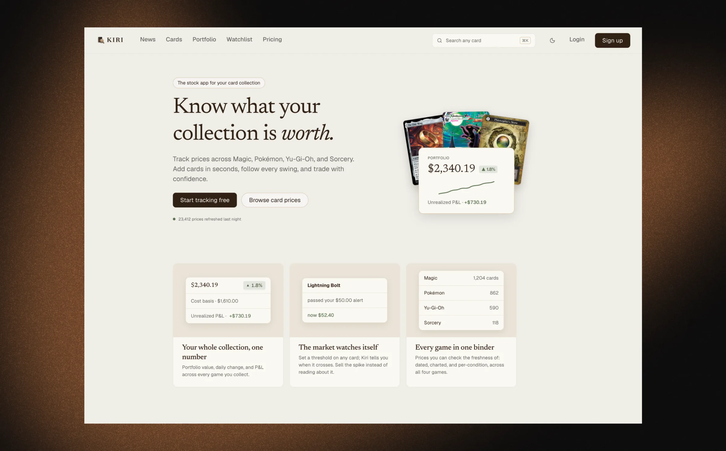
Brokerage apps answered "what is my portfolio worth right now" a decade ago. Card collectors are still doing it with spreadsheets and twenty browser tabs. Kiri is that app for cardboard — live, and one click from a full demo with no signup.
The problem
Serious collectors run five-figure collections out of spreadsheets. Prices live on one site, the collection lives in a binder, and "what is this all worth" means twenty lookups and a calculator. Brokerage apps solved exactly this for stocks: one number at the top, a chart under it, positions below, alerts when something moves.
Kiri tracks value, cost basis, and profit and loss across Magic, Pokémon, Yu-Gi-Oh, and Sorcery, priced per variant — condition, printing, language — with alerts, a watchlist, and a news hub.
It closes out a TCG trilogy: CardScan scans a card and prices it, Warlord Market prices a thin market honestly, and Kiri answers what the whole collection is doing.
What it does
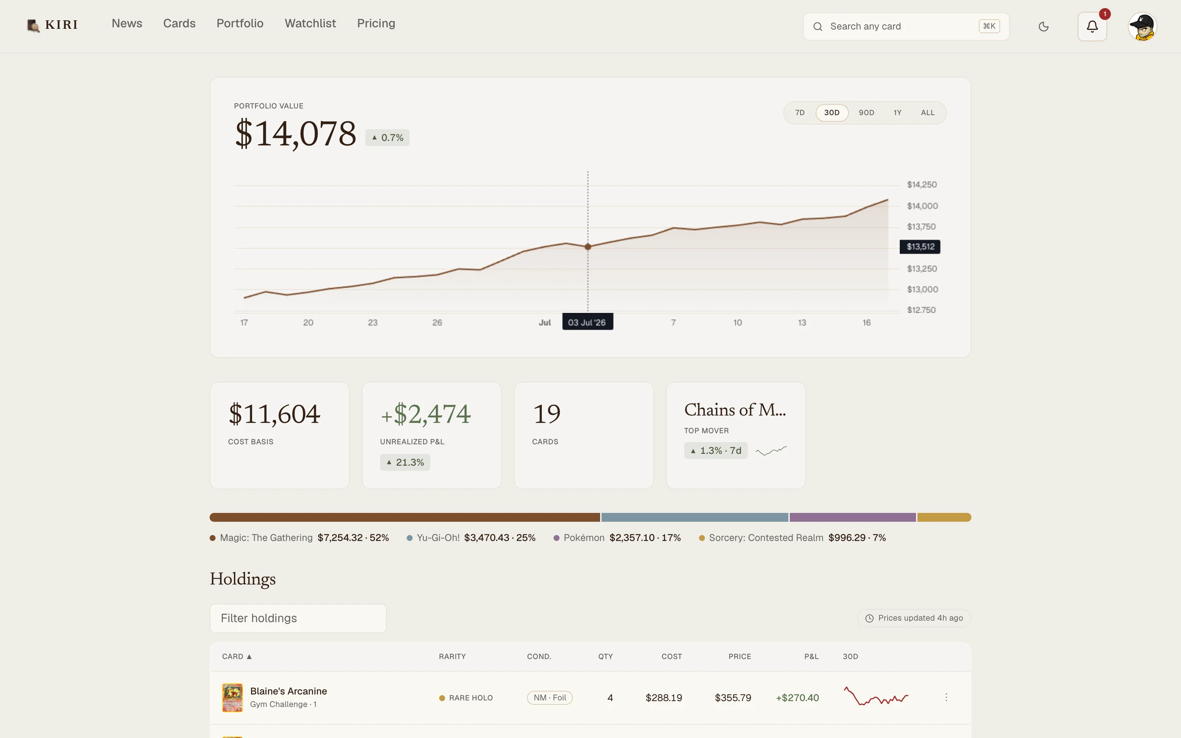
Clicking "Explore the demo" creates an anonymous account stocked with a realistic portfolio: 19 cards across all four games, real card art, 90 days of price history, a watchlist, and an alert already waiting in the bell. No signup, no empty state.
The design system is as much the product as the app, so it ships alongside it as a public style guide.
Brand exploration
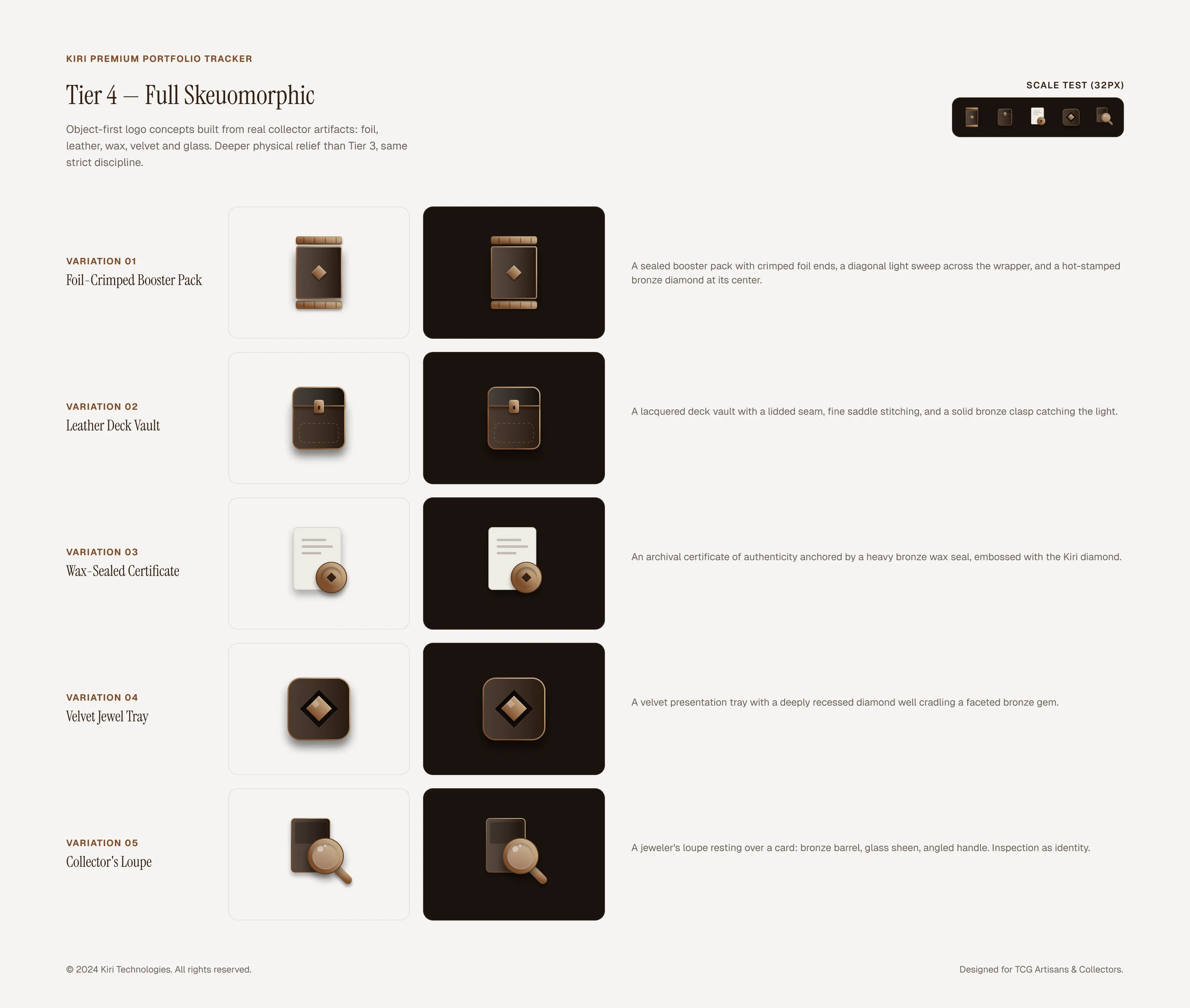
The identity started as one question: what object earns a collector's trust? I worked through it in Figma, board by board, and landed on five concepts built from real collector artifacts — a foil-crimped booster pack, a leather deck vault, a wax-sealed certificate, a velvet jewel tray, and a jeweler's loupe over a card. Every concept had to stay legible at 32 pixels to earn a spot on the board.
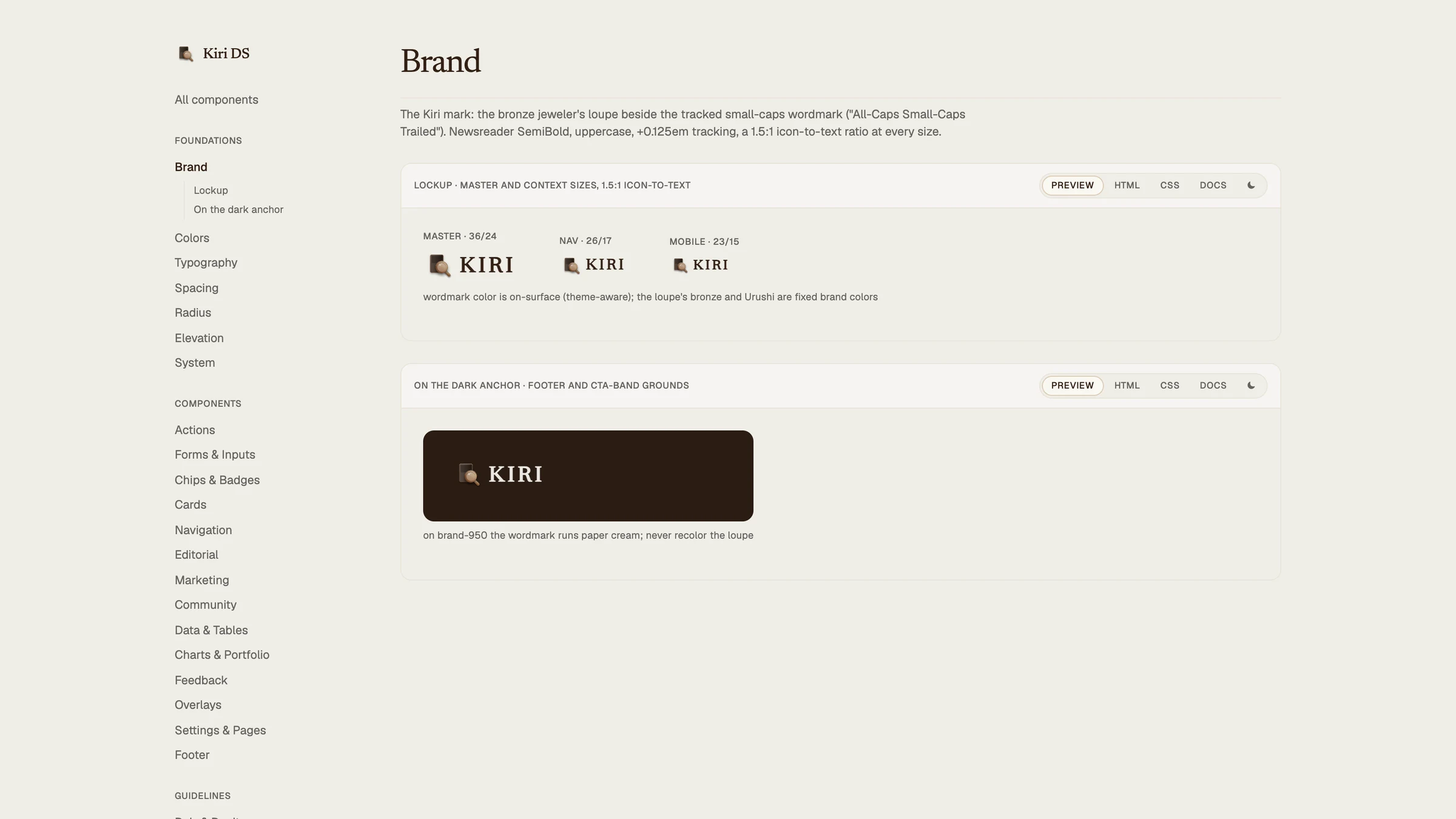
The loupe won: inspection as identity, which is what a pricing product does all day. A second board tested six wordmark pairings around it. The winner locks KIRI in tracked small caps to the loupe at a strict 1.5:1 ratio that holds from the 36px master down to the mobile bar. The same loupe became the favicon, drawn on a rounded tile so it reads in both light and dark browser chrome.
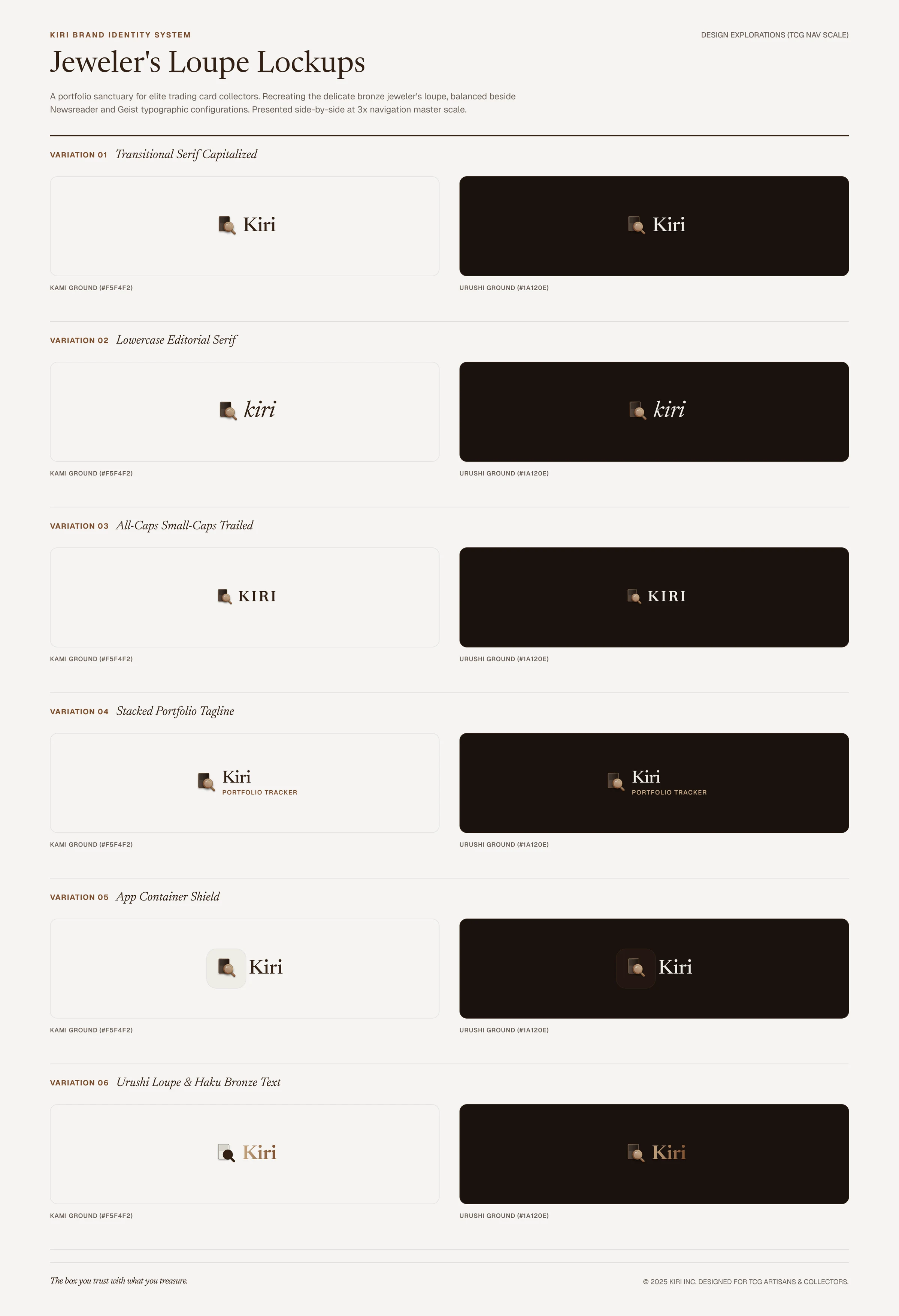
The exploration didn't stay in Figma. The lockup graduated into the design system with its own section: the size ramp, the ratio spec, and the usage rules the rest of the product inherits.
The interesting problems
The design system is public, so it can't drift
Every product decision routes through one spec file, mirrored by a style guide with 83 stories and deployed with the app. Each story is a working panel: a live preview, HTML and CSS extracted from the running stylesheet, docs pulled from the spec, and a light/dark toggle.
The discipline paid off the week I shipped. In dark mode, the border color and the raised-surface color turned out to be the same hex — which collapsed the homepage feature cards into one flat brown, dividers and all. The fix was a token, not a patch: a new color that recesses in dark mode, added to the spec, the guide, and the app in one change.
Every public One Piece scan says SAMPLE
The plan was Magic, Pokémon, and One Piece in the hero. Magic and Pokémon both have free, clean, keyless data. One Piece has nothing: Bandai watermarks every public card image with a diagonal SAMPLE — on the official EN, JP, and Asia card lists, on the fan databases, and on TCGplayer's product shot of a $2,699 manga rare. There is no clean scan available anywhere. That killed the game for the hero, and Sorcery took its slot.
Sorcery brought its own puzzle: its community API carries no image field at all. But its variant slugs map directly onto another card CDN, so the catalog builds every image URL itself and gets real art for free. The lesson: in card products, image rights and image plumbing are a feature, not a pipeline detail.
A demo you don't sign up for
Kiri is a portfolio piece, so onboarding had to assume a visitor with thirty seconds, not a user with intent. The primary action creates an anonymous account and seeds it; Google sign-in is the secondary path, captioned with exactly what it stores.
The seeded cards are deliberately bought below current price, so the first impression is a green number. The price history is generated per card and lands on the real current total, so the chart tells a coherent 90-day story instead of noise.
Dark mode is a second rendering, not a filter
Dark mode swaps the palette rather than inverting the screens, so every color lifts toward paper and stays readable on the dark brown surfaces. Two things fought it.
The charting library locks its colors in at startup, so flipping the theme left pale gridlines on a dark ground; the chart now rebuilds itself when the theme changes. And the soft bronze shadows that carry depth on paper are invisible on dark ground, so raised elements switch depth cues entirely — hairline borders and black-based shadows instead of tinted ones.
The design loop
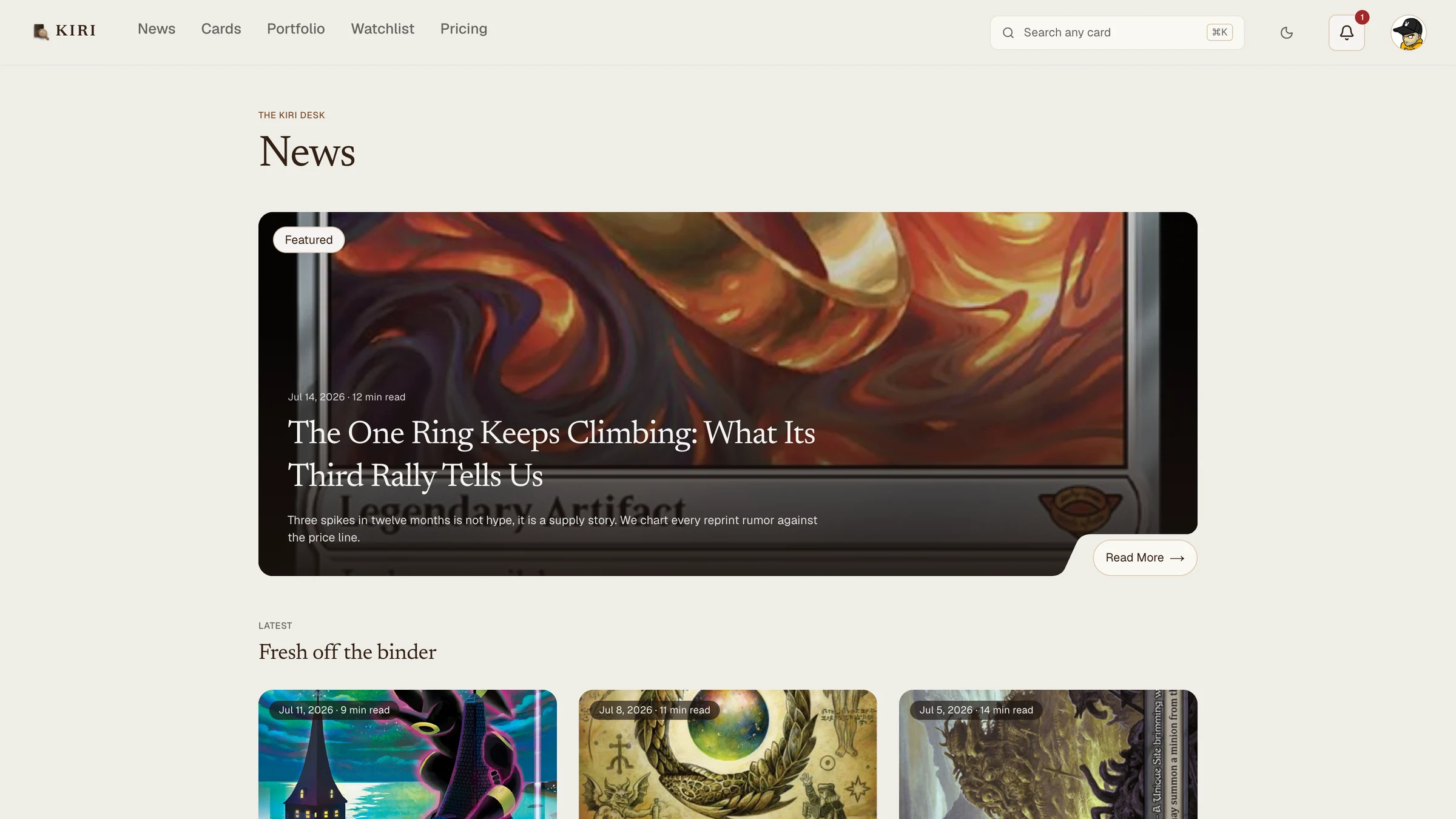
Every contested surface went through the same loop. When a screen had several viable shapes — the homepage hero, the news hub, the article header — Claude built the variants as real coded pages, I reviewed screenshots, picked one, and deleted the rest. The news hub went through three layouts that way. The cover header that shipped is one of three I could actually click through, not imagine.
What I'd do differently
Design demo-first from day one. Kiri grew a full auth stack, billing, and email plumbing before the honest realization that a portfolio prototype needs a one-click demo more than it needs Apple sign-in. The pivot deleted more UI than it added.
Same lesson on data: I burned half the free tier of a paid pricing API before replacing it with free sources and generated histories, which is what a prototype should have used from the start. The pattern from Warlord Market holds — find the data gate first, build the product second.