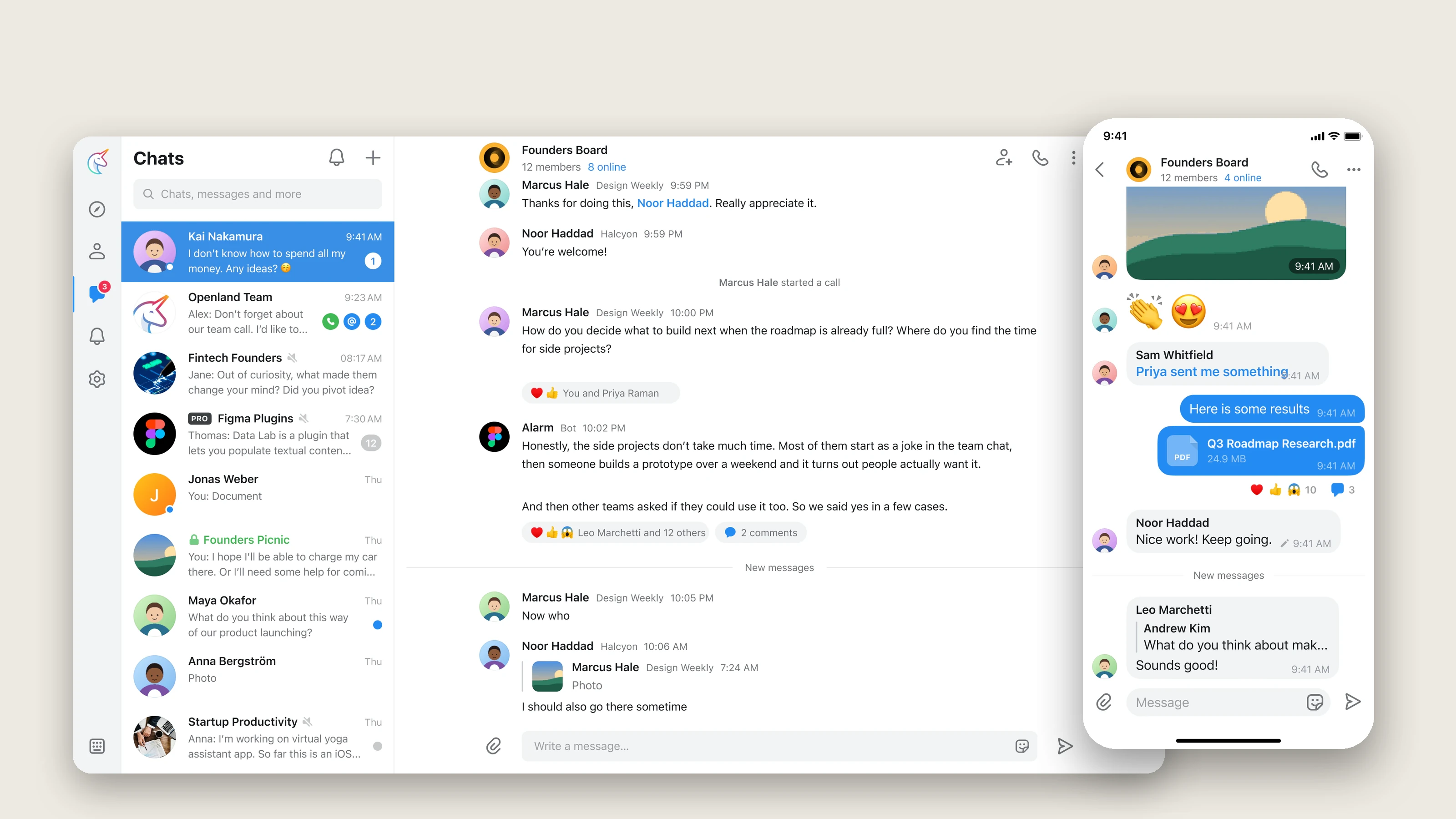
Openland was a YC-backed messenger for communities, compared to Telegram and WhatsApp feature for feature. I was the only designer for eleven months: the iOS and web flows, and the design system underneath them.
Context
A team of about fourteen across the Bay Area, Moldova, and Moscow. Steve Korshakov, ex-Telegram, led engineering and hired me on a six-month freelance contract in March 2019. I stayed until January 2020. There was no other designer.
2019 was the build year. The private beta shipped in July, four months in, and most of what I designed went to production while I was still there.
Steve brought me in for the iOS flows. Web followed almost immediately — the two products were similar enough that designing one without the other meant doing the work twice. There was no design system, so building one became the job underneath the job. I also ended up sitting between the cofounders and engineering more than the contract described: turning Steve and Yury's ideas into designs, and being the person engineers asked when something was ambiguous.
The company closed in April 2022 and open-sourced its code and Figma libraries. Everything here is rebuilt from those published files, with the sample people and companies replaced.
The design system
I built it in Figma first, then in Storybook, so engineers saw the same thing I did.
It ended up as two platform kits on shared foundations. Color and icons are shared. Type, corners, and shadows are platform-specific: web runs one step smaller with no letter-spacing, corners are tighter than iOS, and web gets hover states, tooltips, popups, and modals that have no iOS equivalent.
The alternative was one responsive kit. That's cheaper on day one and wrong by the second month, because an iOS list cell and a web list cell aren't the same thing at different widths. Two kits meant every component existed twice, but each one was honest about the platform it lived on.
About 90 tokens organized by role rather than hue, 14 text styles per platform, and around forty components. The list cell and the avatar do most of the work — between them they appear on nearly every screen. The 350-icon set predates me; the company bought it before I arrived, so my job was folding it into the system at four sizes, not drawing it.
Three decisions I'd make again
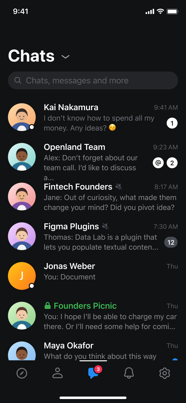
Dark mode, before anyone asked for it
When dark mode came up, engineering's answer was that it meant touching every screen twice. But I'd built the palette as roles from the start — foreground primary, background secondary, accent — rather than named colors. So dark mode was a second value per token, not a second set of screens. That's the only reason it shipped. Once we started, it was live within a week.
Email sign-in, next to phone
Steve's default was Telegram's: phone number, nothing else. I argued for email as a first-class path, because the product was pitched at communities — and the people organizing them, sending invites and managing members, were doing it from a desk with a work email, not a phone number they wanted to hand out. We kept phone first, with email one tap below. Once the organizer case was on the table, both founders were fine with both.
A chat screen that felt like Telegram without being Telegram
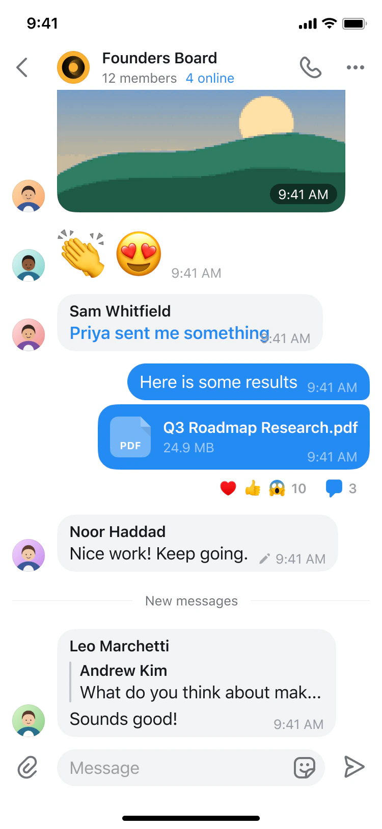
The chat screen went through more rounds than anything else. The founders wanted it to feel as fast and familiar as Telegram, and the danger was that familiar slides into copy.
What made it Openland's was the bubble and color treatment: our own shape and radii, accent blue for outgoing and a quiet grey for incoming, with reactions in a pill under the message rather than inside it. Stickers were a founder priority from the start, so they got a proper home in the composer instead of being bolted on later.
On web I dropped bubbles entirely for a left-aligned layout with avatars. It reads better on a wide screen, and it made the two platforms feel like siblings rather than a port.
The flows
Sixteen iOS screens, from sign-in through chats, discovery, settings, and calls. Scroll sideways.
Eighteen web screens covering the same ground, plus the web-only pieces: contacts, the call space, rooms.
Working in the code
Storybook was the source of truth for what was live, so I worked from it as much as from Figma. When a spacing or color was off in the shipped web app, I made the CSS change on a branch and opened it for the engineers rather than filing a ticket with a screenshot. On iOS, which was SwiftUI, I reviewed against the system and paired with the engineer on fixes.
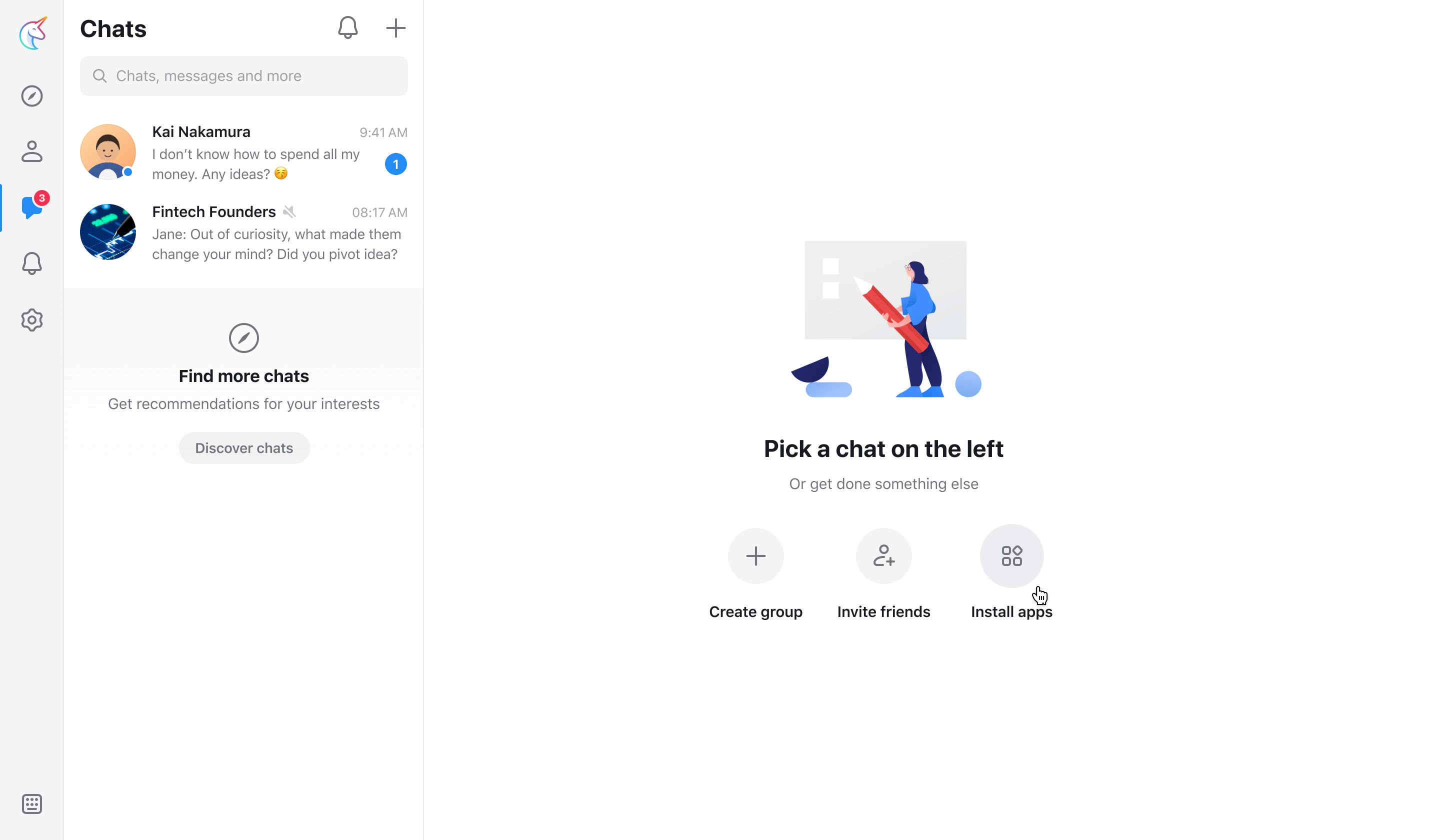
The clearest example is the sidebar rail on web. I tried different icons for Discover, Contacts, Chats, Notifications, and Settings directly in a branch, so I could see them at size in the running app, and matched them to the iOS tab bar so the same five glyphs read the same way on both platforms.
What happened
I was let go in January 2020 in budget cuts. The app launched publicly in October 2020, and the company closed in April 2022, open-sourcing the code and publishing the Figma libraries. That's the only reason this page has anything to show.
If I did it again, I'd be more open about how I felt the app was maturing. As a freelancer you only have so much say, but I could have said more, earlier.
Artifacts
- The design system, rebuilt from the published Figma libraries: openland-ds.vercel.app
- The logo and brand marks were done by an agency, and the icon set was purchased before I joined. Neither is my work.